Figma Utopian project kickstarter file
I design a lot of websites. Some of my clients have no existing digital styles or assets. Others have expansive digital estates and mature style guides. Whenever possible, I use this Figma file as a starting point for both client types, whether we're producing a disposable prototype or a production-ready website design. I update this file often and publish it to Figma Community for anybody to use freely.

Every project is different but all have similarities. I don't want to waste time recreating UI basics on every project but I don't want a starter kit that tries to do the design work for me. I don't want to wade around in an exhaustive set of components I'll rarely use: I want just enough components to give me a real head start on any project.
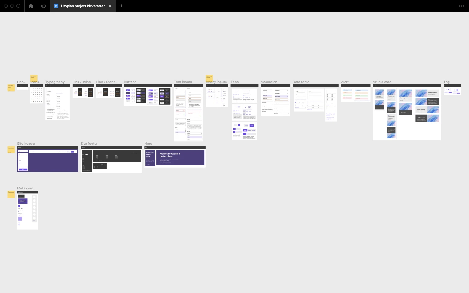
This file is a de-branded average of most of the website design projects I've worked on in the last 10 years, without the bespoke components and page designs.
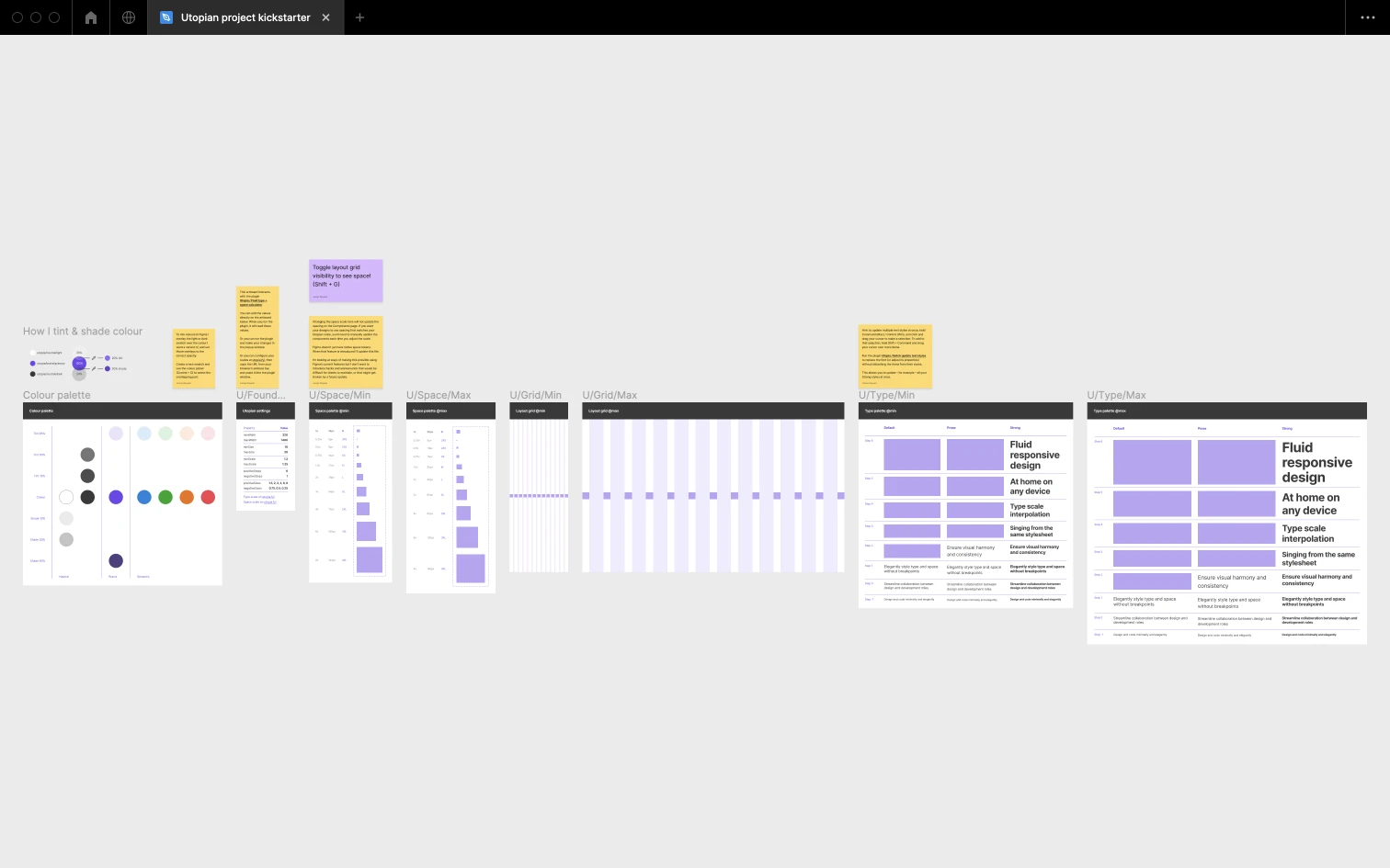
You might notice that every element in the file comes in two sizes: min and max. That refers to the browser viewport width. If you don't know about Utopia, or the concept of fluid responsive design in general, I suggest watching this introductory video. If you currently produce page designs for more than two screen sizes, you'll soon be able to stop doing that.
This file has two companion Figma plugins:
The first replaces the file's default space and type size values. The second enables batch editing of named text styles, which is not possible natively in Figma. With both plugins, the type adjustments cascade through the components in the file. Since Figma doesn't yet have native space tokens, any space adjustments need to be manually applied to each component.
You can use this file without touching the plugins but I can't stress enough how much faster they make my process. When it clicks, it feels like cheating.
NOTE: this file is constantly evolving. The version you download will hopefully be better than the screenshots below.

